Walking through my hallway used to feel oddly uncomfortable, though I couldn’t pinpoint why. The family photos and artwork were there, the lighting was adequate, yet something felt perpetually off-balance. It wasn’t until a professional decorator visited for a consultation that the mystery unraveled with embarrassing simplicity: I had been hanging every single frame at the wrong height for nearly a decade.
The revelation came when she glanced at my carefully curated gallery wall and immediately asked, “Why are all your pictures hung so high?” What followed was a masterclass in the 57-inch rule that interior designers swear by, but somehow never gets shared widely enough with the rest of us.
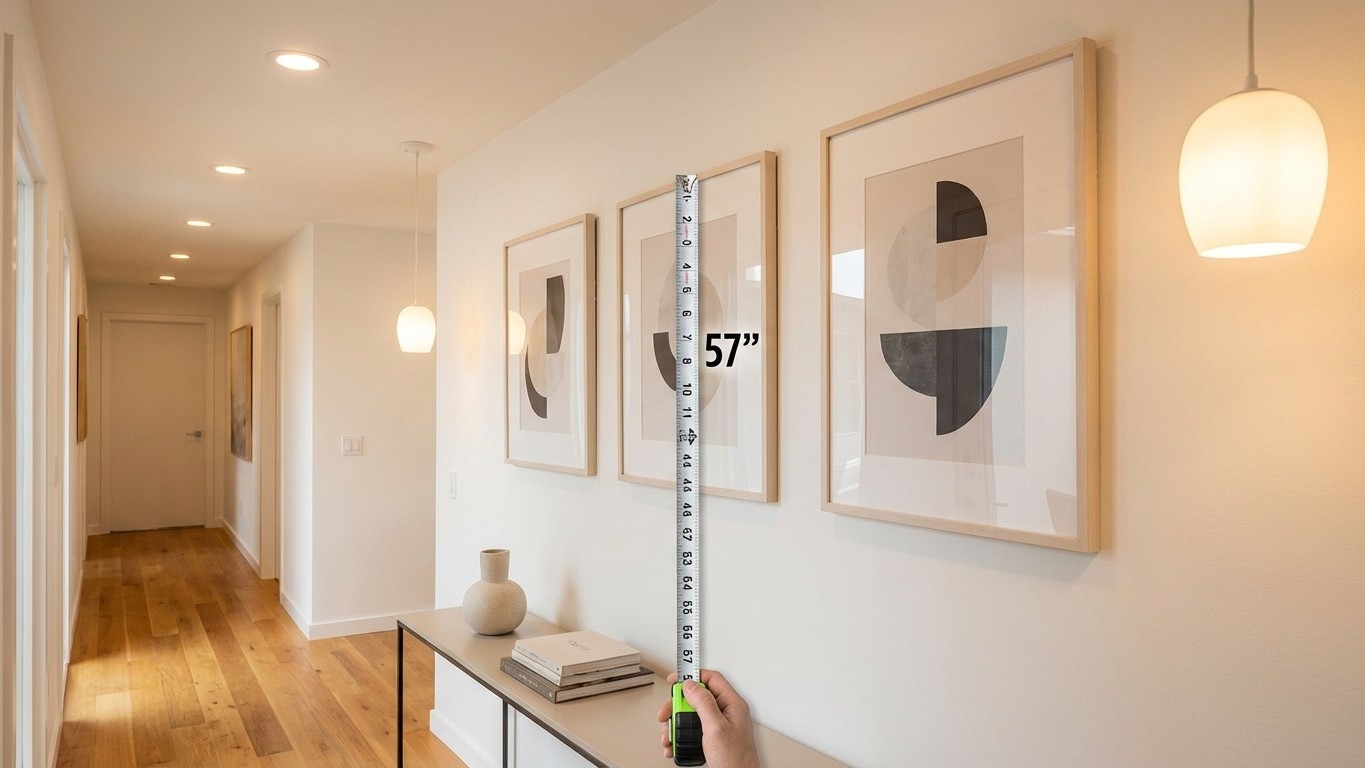
The Universal Height That Actually Works
The decorator’s golden rule is deceptively simple: the center of every frame should sit at 57 inches from the floor. This measurement isn’t arbitrary—it represents the average eye level for most adults and creates the most natural, comfortable viewing experience. Museums and galleries have used this standard for decades because it works universally, regardless of ceiling height or room proportions.
What makes this rule particularly powerful is its consistency. Whether you’re hanging a single statement piece or creating a complex gallery wall, using 57 inches as your center point creates visual harmony throughout the space. The decorator explained that when frames are hung too high—as mine were, hovering around 65 to 70 inches—they disconnect from the human scale of the room and create an uncomfortable upward gaze that strains the neck and disrupts the flow of movement through the space.
Implementing this rule requires a slight shift in thinking. Instead of measuring from the bottom or top of the frame, you measure to find the exact center point. For a 16-inch tall frame, the top should hang at 65 inches from the floor, with the center at the crucial 57-inch mark. This mathematical approach eliminates the guesswork that leads to uneven, awkward arrangements.
The Psychology Behind Perfect Placement
The impact goes beyond mere aesthetics. When artwork hangs at the proper height, it integrates seamlessly into the room’s ecosystem rather than floating above it like an afterthought. The decorator pointed out that properly hung frames create a visual connection with furniture and architectural elements, making the entire space feel more intentional and professionally designed.
This principle becomes especially important in hallways, where people move through quickly and need visual anchors that feel natural and welcoming. High-hung frames create a sensation of visual weight concentrated in the upper portion of the space, making corridors feel top-heavy and unbalanced. The 57-inch rule grounds the artwork in the space where human interaction actually occurs.
The psychological comfort extends to how we process the space subconsciously. When frames hang at natural eye level, we can appreciate them without conscious effort or physical adjustment. This effortless engagement makes rooms feel more livable and authentic, rather than formal or museum-like.
Practical Application in Real Homes
Transitioning to the new height felt dramatic at first. Frames that had seemed perfectly normal suddenly appeared to hover awkwardly high on the walls. The decorator assured me this adjustment period was normal—our eyes become accustomed to whatever we see daily, even when it’s technically incorrect.
The transformation became apparent within days. The hallway felt more intimate and welcoming, with the artwork becoming part of the lived-in experience rather than decoration to be admired from a distance. Guests began pausing to actually look at the photos, something that rarely happened when they were mounted higher.
For rooms with existing furniture, the rule adapts beautifully. Above sofas or console tables, maintaining the 57-inch center point ensures artwork relates properly to both human scale and furniture proportions. The decorator showed me how this creates visual layers that make rooms feel more sophisticated and thoughtfully composed.
Beyond the Basic Rule
While 57 inches serves as the universal baseline, the decorator shared subtle variations for specific situations. In dining rooms where people are primarily seated, dropping the center point to 54 or 55 inches creates better sightlines from chairs. Conversely, in areas where people stand more frequently, like kitchens or entryways, the full 57 inches maintains optimal viewing comfort.
The revelation extended to groupings and gallery walls, where maintaining consistent center points across different frame sizes creates professional-looking arrangements. Rather than aligning tops or bottoms of frames, keeping all centers at 57 inches allows for varied frame sizes while maintaining visual cohesion.
Looking back, the mistake seems obvious, yet it’s remarkably common. Most people hang frames based on intuition or existing nail holes, leading to the epidemic of high-hanging artwork that plagues so many homes. The 57-inch rule offers a simple solution that immediately elevates any space with minimal effort and maximum impact. Sometimes the most transformative design principles are the simplest ones we’ve been overlooking all along.