Square footage is a zero-sum game, or so most apartment dwellers believe. But Japanese garden design has long operated on a different premise: space is not fixed; it’s a matter of perception, layering, and intentional void. The technique in question, rooted in centuries of Japanese aesthetic philosophy, doesn’t require buying a bigger apartment. It requires rethinking what you’ve already got.
Key takeaways
- A centuries-old Japanese design principle could make your 200-sq-ft apartment feel like a sprawling garden
- Most small indoor gardens fail before a single plant is positioned—but one ceiling hook changes everything
- The same technique that fit entire landscapes into a space smaller than a closet works on your bookshelf
The Philosophy Behind the Illusion
The Japanese concept of ma (間) is the most misunderstood idea in design. Westerners often translate it as “negative space,” which sounds like a polite term for emptiness. It’s not. Ma is the charged pause between elements, the breath a room takes between one plant and the next. In practice, this means resisting the urge to fill every shelf, every corner, every windowsill. A single well-placed specimen in an otherwise bare corner commands the eye the way a soloist commands a concert hall.
This matters more than any specific arrangement trick, because most small indoor gardens fail before a single plant is positioned. They fail at the concept stage, when the gardener’s instinct is accumulation, more plants, more pots, more color, rather than composition. The Japanese approach flips this: edit first, then arrange.
Vertical Layering: The Actual Space-Doubling Move
Here’s where the technique earns its name. Japanese garden design, whether applied to a moss-covered courtyard or a Tokyo apartment — operates on three distinct vertical planes simultaneously: ground level, eye level, and overhead. Most indoor gardeners only use one, maybe two. Activating all three creates the perceptual illusion of a garden three times its actual footprint.
At ground level, low-growing specimens like mondo grass, miniature ferns, or small creeping plants anchor the composition. They create a sense of floor, a defined base the eye can rest on. Eye level is where most people concentrate their efforts: shelves, windowsills, table arrangements. The overhead plane, though, is where small spaces are genuinely transformed. A trailing pothos or string of pearls suspended from a ceiling hook doesn’t just add greenery; it pulls the viewer’s gaze upward, making the ceiling feel higher and the room feel taller. A 2018 study from the University of Queensland found that vertical visual complexity in Designers-use-to-make-budget-spaces-look-expensive/”>Interior spaces is directly associated with perceived room size — something Japanese designers understood intuitively long before anyone published a paper on it.
The key is visual continuity between the three planes. If the ground level, the shelves, and the ceiling hooks feel like three separate decisions made on three separate days, the layering fails. Repetition of texture (similar leaf shapes, compatible pot materials) ties the levels together into a single readable composition.
The Borrowed Landscape Trick
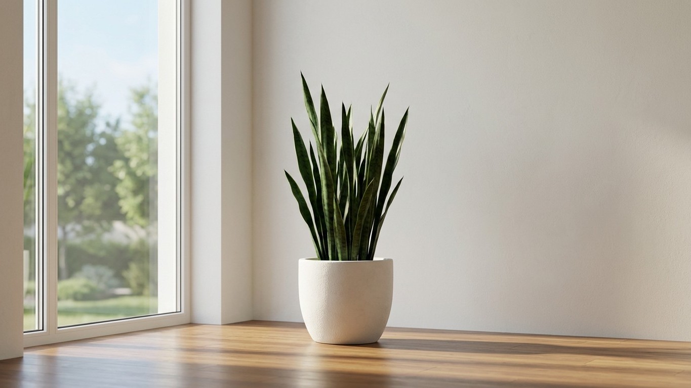
There’s a classical Japanese technique called shakkei (借景), or “borrowed scenery,” where garden designers intentionally incorporate distant views, mountains, trees, a neighbor’s roofline, into the visual composition of their own space. The boundary of the garden expands beyond its actual fence line. In a cramped apartment, this translates directly to window placement.
Position your most visually striking plant, a tall, architectural snake plant or a delicate Japanese maple bonsai — directly in front of a window. The plant now exists in two visual contexts simultaneously: your interior and the exterior world behind it. The eye can’t help but read the two together, borrowing the depth of the outside view into the interior garden. On cloudy days the effect is softer; on bright mornings it’s borderline theatrical.
Mirrors work on a similar principle, though with less elegance. A mirror placed perpendicular to a plant grouping doubles the visible greenery, a blunter version of shakkei, but effective in windowless corners where the original technique isn’t possible.
Scale Contrast as a Depth Tool
One of the more counterintuitive ideas in Japanese garden composition: placing a very large plant next to a very small one makes a space feel larger, not smaller. The contrast in scale creates a sense of foreground and background, mimicking the visual depth cues we use to perceive distance outdoors. A massive fiddle-leaf fig beside a tiny moss-covered stone, or a sprawling monstera paired with a diminutive succulent arrangement, tricks the brain into reading spatial depth where there isn’t any.
This is the same principle at work in traditional Japanese tsubo niwa (坪庭), the “tsubo garden,” historically a courtyard barely larger than a single tatami mat. These gardens routinely featured a stone lantern at full height beside ground-hugging moss, creating the illusion of a full landscape in a space measured in square feet rather than acres. The design philosophy traveled well. It applies with equal logic to a bathroom corner or a narrow kitchen shelf.
Texture amplifies this effect. Rough bark against smooth stone against feathery fronds, layering tactile variety within a small grouping creates visual richness that reads, perceptually, as physical depth. The eye spends more time on a textured composition, which makes the space feel like it contains more than it Actually does.
Starting Without Starting Over
Applying any of this doesn’t require dismantling what you have. The most practical entry point is subtraction: remove two-thirds of what’s currently on a shelf, leave only the most structurally interesting piece, and sit with the discomfort of the empty space for a week. Most people who try this find the room immediately feels calmer and, oddly, larger. From that emptier baseline, reintroduce plants one at a time, activating a new vertical plane with each addition.
The ceiling hook is often the most transformative single change, costing almost nothing and requiring about ten minutes. A single hanging planter above an existing arrangement immediately activates that underused overhead plane and shifts the entire room’s visual dynamic.
What’s worth sitting with is the deeper implication: if a handful of design principles developed for stone-and-moss gardens in medieval Japan translate directly to a Brooklyn studio apartment in 2026, what does that say about how universal our perception of space actually is, and how much of our sense of “not enough room” is simply a failure of arrangement rather than a lack of square footage?