
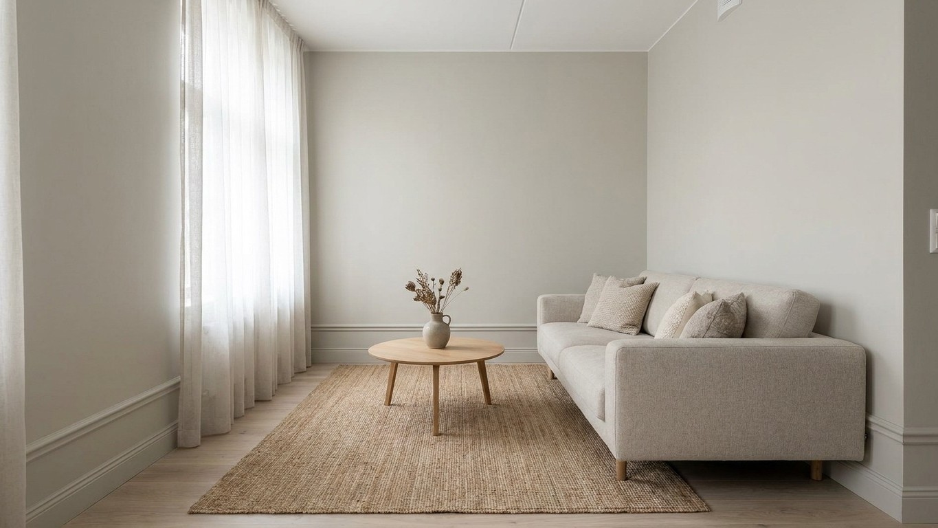
The paint color that makes your skirting boards vanish isn’t a special shade at all: it’s whatever color is already on your walls. Painting the trim to match, rather than defaulting to white, is the single trick designers keep pointing to when a small flat needs to look taller without knocking down a single wall.
For decades, white skirting boards were treated as a rule rather than a choice. Paint the walls whatever you like, but the trim stays white, supposedly for contrast and “definition.” The problem is that this contrast does something nobody actually wants in a 46-square-meter apartment: it draws a hard line exactly where you don’t need one, right at floor level, chopping the wall visually in half.
Key takeaways
- Why the ‘sock and trouser problem’ is making your small flat feel shorter than it actually is
- The geometric illusion that makes matching skirting boards work for both pale and dark colors
- How color drenching takes this trick even further—and what ‘color capping’ means for 2026
The sock-and-trouser problem
Interior designer Kelly Hoppen summed up the issue with an image that’s hard to unsee once you’ve heard it. She recommends painting the skirting boards in a room the same grey as the wall colour, because it will make the whole wall look a lot taller, whereas painting them white is a bit like wearing a sock with your trouser leg too high. It looks a bit odd, and once you notice it in your own living room, you can’t unsee it either.
The mechanism at play is simple geometry tricking the eye. When you remove the stark line of white trim, your walls appear taller and the whole space feels more connected, which is a particularly effective trick in small living rooms or spaces with lower ceilings, where that sense of height really matters. A 46-square-meter flat almost always comes with modest ceiling heights, so this isn’t a cosmetic nicety. It’s one of the few zero-cost ways to fight a genuine spatial constraint.
Lee Trethewey, an interiors expert quoted by Homebuilding & Renovating, puts it plainly: painting your skirting boards the same colour as your walls removes visual boundaries and draws the eye upwards, rather than downwards. Downward-drawing lines are exactly what you don’t want in a compact space. Every horizontal break the eye catches reminds it, subconsciously, of where the room stops.
Why this beats a “safe” white every time
The instinct to keep trim white comes from a reasonable place. White is still the most popular skirting board colour for a reason: it suits almost every wall colour, it makes profile detail easier to see, and it leaves more freedom to repaint the rest of the room later. That’s a fine argument for a rental you might repaint next year. It’s a weak argument for a small flat you actually live in and want to feel bigger today.
Matching color does something white never can: it reclaims the vertical space. Using the same shade for walls and skirting boards is an easy way to make a room look bigger by creating a continuous flow where the walls reclaim the height of the skirting boards, extending the perception of distance from floor to ceiling, and that goes for both light and dark colours. Notice that last part. This isn’t only a trick for pale, airy schemes. It works whether you’re painting in soft greige or committing to a deep charcoal.
Older apartments benefit even more, oddly enough. In older buildings, tonal skirting is particularly forgiving, because walls that aren’t perfectly straight, floors that slope slightly, and corners that aren’t quite 90 degrees become far less noticeable when there’s no bright white line highlighting every imperfection. If your building predates 1970 and nothing quite lines up, matching your skirting to the wall isn’t just a style choice. It’s damage control.
Color drenching, and why designers are taking it further
This single-shade approach to skirting boards is really the entry point into a broader movement decorators call color drenching. Colour drenching is taking one colour and painting everything from your walls to your woodwork in it, including skirting boards, radiators, doors, window frames, picture rails and ceilings. The logic scales up the same way it does for trim alone: by painting everything one colour, there is no contrast for your eye to focus on, so corners and edges are softened and the line between the wall and the ceiling blends, making a space feel more expansive.If a full ceiling-to-floor commitment feels like too much for a rental or a first attempt, there’s a lighter version worth knowing about too. Some designers now use what’s being called color capping for 2026, where a darker tone caps the top of the wall and ceiling while lighter shades work down toward the floor, creating a gradient rather than one flat block of color. A darker shade covers the ceiling and caps the top of the walls while lighter tones work their way down to the floor, making the ceiling feel higher or the room feel bigger depending on the space. It’s a gentler cousin of the same idea: manage contrast deliberately instead of letting it happen by default at ankle height.
One caveat worth keeping in mind before you reach for the roller: this isn’t a universal rule for every room. Contrast still has its place, especially if you want to highlight period features or add a touch of definition around the edges. If you’ve got original Victorian cornicing or a carved skirting profile you actually want people to notice, painting it invisible defeats the purpose. Save the matching trick for the rooms where the goal is calm and height, not architectural showmanship, and let the detail-rich rooms keep their contrast.
Sources : homebuilding.co.uk | nationalskirting.co.uk