
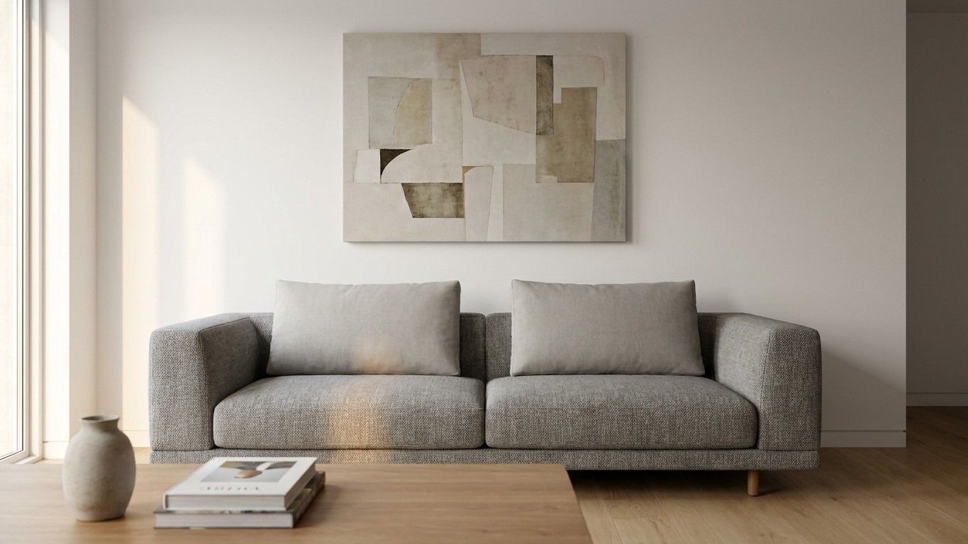
Stand back from your sofa and look at that wall above it. If you can slide a hand comfortably between the top of the frame and the artwork hanging above, twice over, you’ve probably fallen into the same trap as most homeowners: hanging your pictures too high. That gap of dead space isn’t a small styling quirk. It’s the single most common reason a living room feels disconnected, even when every other element (paint, furniture, lighting) is technically right.
The fix costs nothing and takes about ten minutes with a tape measure. But first, it helps to understand why this mistake happens to nearly everyone, including people with genuinely good taste.
Key takeaways
- The standard 57-inch eye-level rule doesn’t apply when furniture is involved—and nearly everyone gets this wrong
- There’s a specific distance measurement that instantly fixes the disconnected look in most living rooms
- Width and proportion matter just as much as height—and they work together to create visual harmony
Why We All Aim Too High
Blame it on a rule that got applied in the wrong context. Most people have heard that art should hang at eye level, roughly 57 to 60 inches from the floor, measured to the center of the piece. The best way to hang items in your home is so that the center of your piece is about 57 inches above the floor, and museums and galleries use this rule of thumb to ensure most people can see the decor at eye level. That works beautifully on a bare wall in a hallway or stairwell.
The problem starts the moment furniture enters the picture. When artwork is placed above furniture, the relationship with the furniture becomes more important than the floor measurement. A sofa back typically sits around 30 to 34 inches off the ground. If you then center your art at 57 inches, you’ve suddenly created a canyon of blank wall between the two, sometimes 15 or 20 inches of nothing. Visually, that gap reads as a seam, a line that splits the wall into an upper zone and a lower zone that don’t talk to each other. Hanging too high is the most frequent mistake, usually from centering on the wall’s height rather than measuring from the sofa.
There’s also a psychological pull toward height that has nothing to do with design logic. Taller ceilings, in particular, tempt people to fill the vertical space. But even with soaring ceilings, the height at which you hang wall art above a sofa stays the same, since the art is meant to relate to the sofa, not to the ceiling. A nine-foot ceiling doesn’t change the math. It just means there’s more bare wall above your frame, and that’s fine, as long as the gap directly above the sofa stays tight.
The Number That Actually Matters: 6 to 10 Inches
Forget the eye-level rule when furniture is involved. The measurement that governs Everything here is the distance between the top of the sofa back and the bottom edge of the frame. When hanging above a bed or sofa, the bottom of the picture frame should be eight to 10 inches above the furniture. Some designers push that window slightly wider, allowing about 6 to 12 inches of space between the top of the furniture and the bottom of the artwork, but the principle is identical: keep it tight enough that the eye reads the art and the sofa as one composed unit.
Go under that range and the piece looks like it’s resting directly on the cushions. Go much over it and you’re back to square one. Less than 6 inches and the art looks like it is resting on the furniture, while more than 12 inches breaks the connection, so the art floats off on its own.
Ceiling height does play a minor supporting role, but only at the margins. One interior designer offers a useful anchor point: if you have 8-foot ceilings and a moderately large piece, you might leave approximately 8 inches between the top of the sofa and the art, while 9-plus foot ceilings can bump up to around 12 inches so the picture doesn’t look like it’s weighing too heavily on the sofa. Notice that even the generous end of that range never approaches the 57-inch eye-level number. It’s a few extra inches, not a few extra feet.
Width Matters Almost as Much as Height
Getting the vertical gap right solves half the problem. The other half is proportion. A single small frame centered eight inches above a wide sectional will still look lost, no matter how perfectly you’ve measured the gap, because it doesn’t relate to the furniture’s scale. A piece or group of pieces above a sofa should span about two-thirds the furniture’s width. Some sources widen that target slightly, suggesting artwork that is approximately 66–75% of the width of the sofa beneath it for the most balanced look.
In practical terms, that means a standard 84-inch sofa pairs beautifully with art around 56 inches wide, whether that is one big canvas or a gallery wall with even spacing. A smaller loveseat scales down accordingly. If you’re working with a gallery arrangement rather than one large canvas, treat the whole grouping, frames and gaps included, as a single object when measuring that two-thirds width.
Before hammering anything into drywall, use painter’s tape to outline the exact footprint on the wall. Stand across the room, sit on the sofa, walk past it. The tape costs a dollar and saves you from three nail holes you didn’t need. And if you’re hanging into anything heavier than a lightweight print, anchor into a stud rather than relying on drywall alone. A canvas that’s two-thirds the width of your sofa carries real weight, and a single failed hook at 2 a.m. is not the kind of design lesson anyone wants to learn twice.
Sources : jjonesdesignco.com | jessieshome.com