Beige has long been the go-to neutral in home design, offering a safe and understated backdrop. But as we step into 2026, a vibrant contender is taking center stage: chartreuse. This bold yellow-green hue is infusing homes with energy and personality, signaling a departure from muted palettes.
Key takeaways
- Why chartreuse is becoming the new go-to color, replacing beige.
- Simple ways to incorporate chartreuse without overwhelming your space.
- How pairing chartreuse with other bold hues creates stunning interiors.
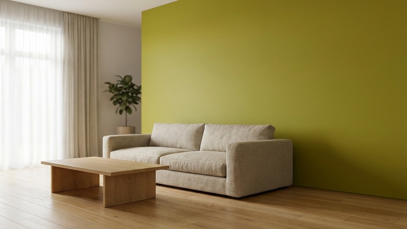
Chartreuse: The New Neutral?
Chartreuse is making waves in interior design circles. Designers are embracing this lively color for its versatility and ability to complement various aesthetics. From lively and maximalist to calming and subtle, chartreuse adapts seamlessly. livingetc.com
Consider Benjamin Moore’s ‘Wasabi,’ a lively pistachio green that pairs effectively with pink and red tones in modern interiors. livingetc.com This shade exemplifies how chartreuse can serve as a dynamic accent or a dominant theme, depending on its application.
Incorporating Chartreuse Without Overwhelm
Introducing such a bold color might seem daunting, but there are strategic ways to weave chartreuse into your home:
- Accent Walls: A single chartreuse wall can invigorate a room without overpowering it. Pair it with neutral furnishings to balance the vibrancy.
- Furniture Pieces: A chartreuse sofa or armchair can serve as a statement piece, adding a pop of color to an otherwise subdued space.
- Accessories: For a subtle approach, incorporate chartreuse through throw pillows, vases, or artwork. This allows for flexibility and experimentation without commitment.
Designers emphasize the importance of harmonizing chartreuse with complementary colors and natural textures to create balanced and inviting spaces. livingetc.com
Pairing Chartreuse with Other Trends
Chartreuse pairs well with several emerging color trends for 2026. For instance, the resurgence of earthy umber tones provides a grounding contrast to chartreuse’s brightness. vogue.com Additionally, the popularity of deep, moody hues like burgundy and chocolate brown offers a rich backdrop that allows chartreuse accents to shine. s203.q4cdn.com
Incorporating chartreuse alongside these colors can create a dynamic and contemporary aesthetic. For example, a chartreuse accent chair against a burgundy wall can create a striking visual contrast, while chartreuse accessories in a room with chocolate brown furnishings can add a touch of vibrancy.
Embracing the Bold with Confidence
Stepping away from the safety of beige and embracing chartreuse requires a shift in mindset. It’s about welcoming color and energy into your living spaces. Start small if you’re hesitant, perhaps with a chartreuse lamp or a set of dining chairs. Observe how the color interacts with your existing decor and how it makes you feel.
Remember, design is personal. While trends provide inspiration, your home should reflect your personality and preferences. If chartreuse resonates with you, find ways to incorporate it that feel authentic and comfortable.
As 2026 unfolds, the move towards bold, expressive colors like chartreuse signifies a broader trend in home design: a desire for spaces that are functional. Also, vibrant and full of life. So, why not take the plunge? Embrace chartreuse and let your home reflect the energy and optimism of the times.