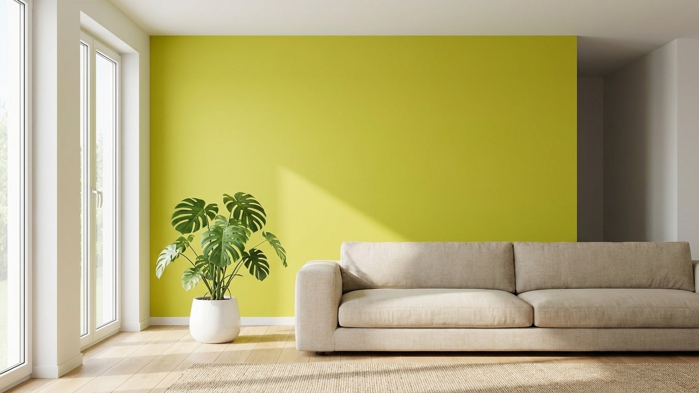
White walls have long been the default choice for living rooms, offering a blank canvas that suits various styles. However, as we step into 2026, a bold and unexpected hue is taking center stage: chartreuse. This vibrant yellow-green shade is redefining interior spaces, infusing them with energy and sophistication.
Key takeaways
- Why white walls are losing their charm in 2026.
- How chartreuse adds energy and sophistication to living rooms.
- Top designer tips for incorporating this bold color effortlessly.
Chartreuse: The Bold Choice for 2026
Chartreuse, a striking blend of yellow and green, is emerging as the go-to color for living rooms in 2026. Designers are embracing this lively hue to break away from traditional neutrals, bringing a fresh and dynamic feel to interiors. According to a recent feature by *Livingetc*, chartreuse paint colors are becoming a major trend, offering a lively alternative to the neutrals that have dominated in recent years.
Incorporating Chartreuse into Your Living Space
Integrating chartreuse into your living room might seem daunting, but with thoughtful application, it Can Transform Your space. Here are some designer-recommended shades to consider:
- Benjamin Moore’s ‘Wasabi’: A bold yellow-green with a muddied tone that pairs well with pink and red accents for a harmonious space.
- Little Greene’s ‘Boxington’: A modern lime green used in color-drenched powder rooms to infuse energy and a hint of maximalism.
- Paint & Paper Library’s ‘Euphorbia’: A yellow-leaning, uplifting chartreuse that works well with both playful tiles and as a bridge between room color schemes.
- Benjamin Moore’s ‘Pale Avocado’: A lighter, calming shade ideal for soft color-blocking and vintage-inspired interiors.
- Benjamin Moore’s ‘New Lime’: A near-neon chartreuse that adds dramatic flair to kitchens, beautifully reflecting natural light.
- Little Greene’s ‘Olive Colour’: A deeper, mossy green version of chartreuse that acts as an earthy neutral in open-plan spaces.
Designers emphasize balancing these energetic tones with complementary shades and natural materials to maintain a harmonious environment.
Complementary Trends and Colors
While chartreuse is making waves, other colors are also gaining popularity in 2026. For instance, cobalt blue is emerging as a fashionable shade, offering a bold accent that stands out while blending well with existing color schemes. Interior designers are incorporating cobalt blue in various forms, from cushions and vases to coffee tables and lamps, adding dynamic contrast to both minimalist and maximalist spaces.
Additionally, earthy tones like terracotta and warm mahogany are being embraced to create cozy and inviting spaces. These colors provide depth and comfort, especially effective in smaller spaces used at the beginning and end of the day. They offer a harmonious retreat-like feel Without overwhelming the senses.
Why Chartreuse Works
Chartreuse’s appeal lies in its versatility and the energy it brings to a room. It can serve as a statement wall color or be introduced through furniture and accessories. When paired with neutral tones or complementary colors like deep blues and earthy browns, chartreuse creates a balanced and inviting atmosphere. Its ability to reflect natural light also makes spaces feel brighter and more open.
As we move away from the safety of white walls, embracing bold colors like chartreuse allows homeowners to express individuality and create spaces that are both modern and timeless. Whether through a full room makeover or subtle accents, incorporating chartreuse can instantly elevate your living room, making it a true reflection of contemporary design trends.
So, are you ready to say goodbye to white walls and welcome the unexpected vibrancy of chartreuse into your home?